home // text // multi-media // misc // info
video-games game-design design The American Dream on Android!
Just in time for the Pagan festivities, my experimental game The American Dream: Are We Not Drawn Onward to New Era? is now available on the Android Market! It’s free, it’s silly, it may or may not be worthy of 5 minutes of your time.
And once you’re done with that, let’s find out how this little piggy went to Market.
A brief history
Early last year, I submitted The American Dream (TAD) to GAMMA IV, a curated game design expo run by a few of my Real Actual Friends. The challenge: make a game whose input is limited to a single button. This was around the time that Canabalt came out, so I suspected there would be quite a lot of imitators. I suspected, too, that the first designs to come to my mind would also come to others (I was not mistaken, in the end), so I tried to avoid some of the more obvious mechanics.
Inspiration struck, and I went on to create the game in its first incarnation. Looking back on that post, I see what people have pointed out since: I took several opportunities to trash my own game. To make (weak) excuses: the game itself is fairly primitive to look at, and mechanically…well, I won’t say “unique,” but certainly “unusual,” and the combination made me particularly shy in presenting the game.
However, I have since become rather fond of it. The minigames speak for themselves as well as I was able to make them, meaning it’s a fairly thorough realisation of my original intent. And people seem to have enjoyed it—I’ve received a few compliments in person, as well as reading some positive words online (and there’s a certain schadenfreude in hearing someone lament the randomised narrative they endured). So, basically: huzzah!
Fast-forward a few months. The Eastern Bloc (where we’ve hosted the Prince of Arcade and other events in the past) announced a housewarming party to celebrate its fourth anniversary, and put out a call for corresponding pieces examining the intersection of work, home, and life in general. MRGS co-organiser Six generously (and unexpectedly) suggested TAD as a potential piece at the exhibit; not only did the folks at EB (also generously) accept, but they provided a thoroughly rad setup for the game as well.
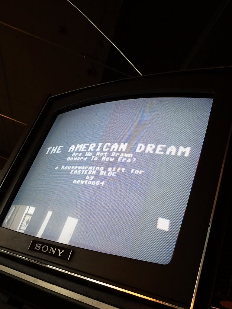
Before the event, I decided to make a few changes in the game’s presentation, as there were a handful of issues that had lingered in the back of my mind after the first release. And at the same time, my 2D game API of choice—Orx—had been successfully ported to Android, and I’d recently acquired an Android phone. It seemed logical to take the extra work I’d done for the gallery exhibit, and roll it into a mobile release (which would also serve as a deployment proof of concept). With a bit of work—and a reliance on the extremely quick, helpful, and insightful folks over on the Orx fora—that port is complete, and available as you see it above.
But what, exactly, were the changes, and why did I implement them? I’m glad I pretended you asked. Let us now proceed to their consideration, in no pellicular order.
TUTORIALS
The first change players will (immediately) notice is the addition of a tutorial option and credits sequence:
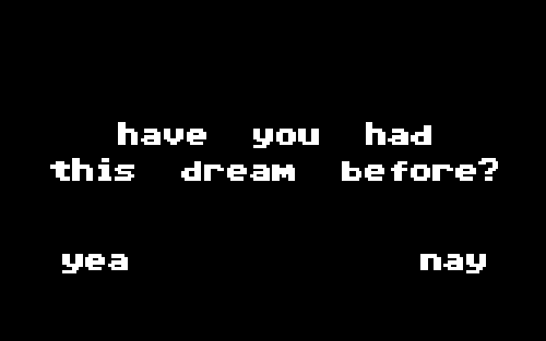
Choosing “nay” will force the player to go through all tutorials before moving on to the LIFE minigame sequence; choosing “yea” will leave all options open. I’d seen a number of new players jump right into LIFE without a clue how to play the game; I decided to provide the (vague, non-explicit) option of a tutorial run for those people. Exactly how many people correlate the question above with tutorial-doingness remains to be seen—but hopefully it will result in fewer heads scratched, which is one of my lifelong ambitions (full disclosure: I wanted to be a shampoo man growing up) (full disclosure: that was a joke and I don’t know what a shampoo man is).
BORN
Nothing new with the BORN minigame. I was happy with it as-is: disgusting in its abstraction. Hmm. Come to think of it, that makes two games of mine that graphically reproduce abstract genitals (the latest). Video games!
WORK
Nothing new with WORK, either. Same shit different day, AM I TRUTHFUL?
PLAY
Likewise, PLAY still rocks. That is, I’m most happy when contrasting the PLAY and WORK minigames. The one is complete drudgery, the other more relaxed and engaging. That one button and a smattering of context can evoke such different feelings was a wonderful lesson to learn, and the reason I made this game in the first place.
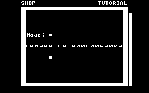
SHOP
Ha! Our first real difference, as demonstrated in the three images below. The first shows the version in the original release; the latter two show the new version.
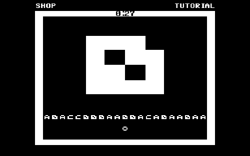
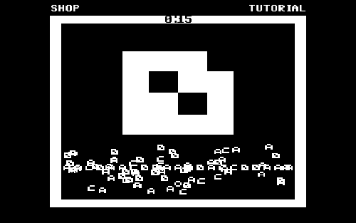
(You may also notice a difference in the game timers: instead of gradually shrinking bars, I simply placed explicit counters. Not very elegant, but I felt this way was a bit more legible than previously.)
In the original release, the “player” token would move in and out of this regularly-advancing line of fashionable items, quickly growing larger (to a maximum) as items were picked up, and then slowly thinning back out; points were awarded for grabbing items “en mode,” and removed when players took items that were out of style. I had in mind some vague idea of slavish devotion to the random whims of fashion barons, and the waste that such entails; I really liked the faceless, marching parade of random items (which I made sure to keep); but the presentation was asymmetrical and felt off balance, while the explicit on-screen text and the arbitrariness of the growing/shrinking token didn’t endear themselves to me.
Then one day I was suddenly struck by the similarities between die-hard consumers and Hungry Hungry Hippos—grab everything you can, and every man, woman, and child for themselves (note that the tutorial “intro text” for SHOP has changed to reflect this). Instead of items disappearing from the Relentless Parade of Random Fashion when bought, they now persist, while the player tries to frantically collect as many as possible before they move on. The “Mode: X” prompt is now abandoned for a much more blatant (and well-centred or balanced) indicator that, I hope, reinforces the feeling of kneeling at the altar of a consumer god. Instead of growing and shrinking, the player instead collects all of the “purchased” items about them, creating a growing, confused garbage pile that complicates further shopping. Improvements that still get my original, higher-level message across, but with what I feel is a much cleaner (and gratifyingly less explicit) presentation.
FUCK
Not a huge visual change in the FUCK minigame, but you can see the old and new versions here:
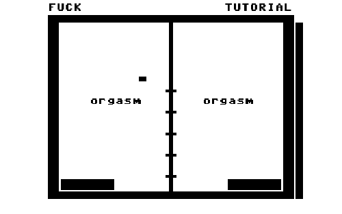
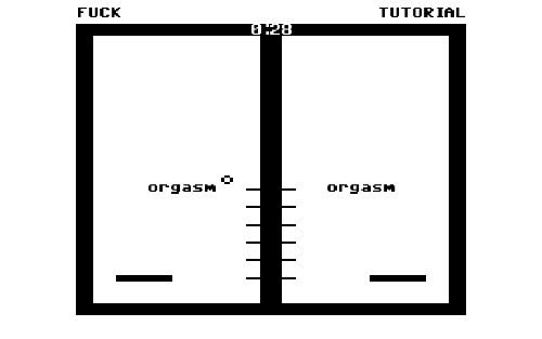
There are more increments before orgasm, but at the same time I gave a bit more space at the top of the screen, since the pellets start flying pretty quickly as either side approaches climax. Furthermore, each paddle “slides” upwards when they hit an arousal pellet, as opposed to simply snapping upwards a notch, which makes it a bit more obvious what’s happening.
In both versions, pellets fall either “in” (close to the central divider) or “out” (close to the edge of the frame), thus (I hope) giving the impression that the paddles are thrusting in and out. However, in the original, there was a small chance that the “in-out-in-out” rhythm would be perturbed (“in-in-out” or otherwise), in theory so that the player would have to pay more attention to their…performance. What it actually did in practice was to destroy any sense of rhythm, and so in the new version I removed that feature altogether: pellets now only fall in a repeating “in-out-in-out” pattern. On the other hand, arousal pellets still fall randomly, which in itself keeps players focused on their actions (near-simultaneous orgasm conferring a large point bonus); the rhythm-randomising was therefore a redundant feature, and removed accordingly. Design by subtraction, as they say on the Internet.
KIDS
Man, KIDS are still dumb. Only change here is that the new version uses Orx’s Box2D physics simulation, which makes the whole experience a lot more graceful (though, I’m happy to say, no less nerve-wracking).
PRAY
Once again, old version on top, new version in the bottom two:
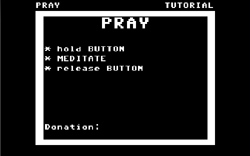
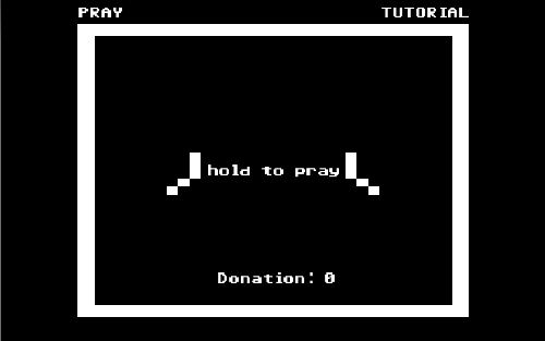
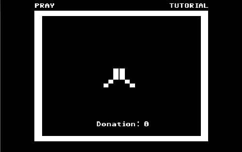
As in my SHOP dilemma, I didn’t like the look of all that text, or the fact that it was so off-balance. Inspired by Craig Adams’ awesome feature on Boing Boing, I pared down the text to something more manageable, centred it, and threw in some bloody awful hand sprites to boot. Once again, I feel like whole minigame is much more legible and aesthetically pleasing now.
DEAD
And last but not least (so to speak): death.
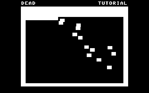
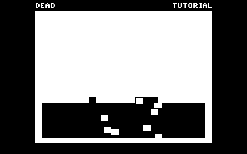
The original version (top) had only three rows of falling snowflakes, which would fall in sequence from right to left, bottom to top; the new version is completely filled with snowflakes, which fall randomly row by row. When I first made the game, I worried that filling the whole frame would confuse the player at first—I wanted them to see the falling flakes immediately. In the new version, I went right ahead and filled the frame, and I think it was the right decision. Having, in the original, exactly three rows of snowflakes seems like an arbitrary number; while the new, fully-white frame at the beginning of DEAD makes a nice visual bookend with the similar graphic at the end of BORN. A visual recurrence and poetry of which I’m certain George Lucas would be proud and WHY DOES HE KEEP CHANGING STAR WARS.
The interaction in the original version was simple: press and hold the button to prevent a few snowflakes from falling. After a few seconds, however, the flakes began to fall regardless—the idea being that one can’t hold on forever. But why did I set the timeout at three seconds, and not five, or ten, or any other number for that matter? Again, this little mechanic felt arbitrary—so I removed it. Now, players can hold on as long as they’d like—but in the end, they will inevitably let go. Once again, by removing a mechanic (a time limit on holding back these snowflakes) and designing by subtraction, the game seems a lot more streamlined and coherent.
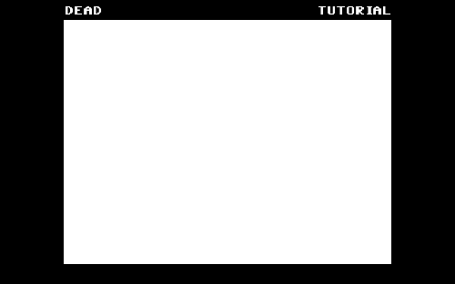
Oh, one more thing about the DEAD minigame. When all is said and done, the last image the player sees is the following:
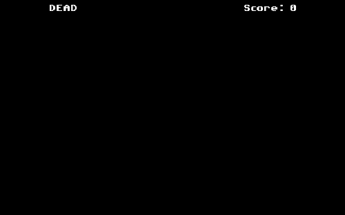
I must sadly admit that it’s entirely accidental, but I’m very fond of the way two UI elements that were otherwise purely functional and incidental suddenly evolve into something more meaningful based on context. What was originally just a coincidence of convenience becomes instead a strong symbol reinforcing the game’s theme. Something to think about when designing UI in the future.
Closing remarks
No game is perfect (Hungry Hungry Hippos notwithstanding), and TAD is obviously no exception. For one thing, the minigames themselves are inconsistent: some only confer points (WORK, FUCK), while others only remove them (KIDS, PRAY); some offer a quick-out before thirty seconds are up (PLAY, WORK, FUCK, PRAY), while the others do not; and so on. But I’m happy with the improvements listed above, and with the game as a whole. Again, it feels like a full implementation of that small little thing I’d been wanting to say since its inception. For which it is probably worth having a beer.
Anyway, many thanks for reading along thus far; I hope you’ve enjoyed this odd assortment of ideas. It’s a simple game, but I may have actually learnt something in the process.
I literally cannot wait to see some of the ratings and comments on this one. Literally. I am physically and emotionally incapable of it.