home // text // multi-media // misc // info
design game-design ko-op video-games Prodding Gnoggins

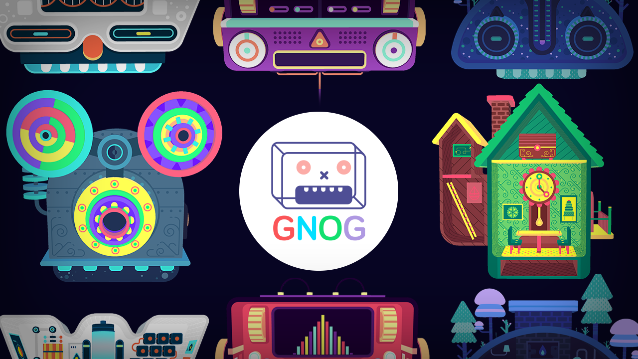
Hi, I’m Nick, the head programmer on GNOG, a game about heads.
It’s a point-and-click puzzle game, and I’m going to talk about a very particular and fundamental part of the game: the cursor. I’ll cover how its look and feel changed over the course of prototyping, development, playtesting, and across a range of platforms, and ultimately look at how the broad goals of GNOG’s design informed the specific mechanics of the cursor, and vice versa.
GNOG is KO_OP’s very first commercial release, launching on PlayStation 4 and iOS in May and November 2017, respectively, with a PC release forthcoming. It has received awards & press, and was nominated for Excellence in Visual Art at the 2016 Independent Games Festival, as well as receiving an honourable mention for Excellence in Audio. We had fun.
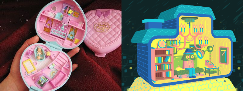
Very generally, GNOG is a puzzle game crossed with imaginary children’s toys, more about exploring these virtual objects and the little worlds they contain than about solving puzzles. It’s inspired by the Polly Pocket and Mighty Max toy sets (among other things), and was always intended to be very tactile and clunky, with all sorts of knobs and buttons to play with. It’s a game – or perhaps, a space – very much about exploration and feel.
 | Polly Pocket (L). GNOG (R).
Given that GNOG is primarily about exploring a small diorama constrained to one screen, we decided that the most straightforward metaphor was point-and-click, and that implied a cursor.
Our first prototypes ran on PCs, with their (now) standard point-and-click controls. However, as fate and business would have it, we eventually signed a deal to launch GNOG on Sony’s PlayStation 4 (PS4) console. That change made us rethink our control analogy to accommodate the PS4’s DualShock controllers. Now, instead of controlling the cursor’s position (as with the mouse), we were controlling its velocity with the DualShock joysticks.
That’s a fundamental difference in terms of programming and design. The particularities of the different inputs are a rich topic unto themselves, so for now I’ll just point out Steve Swink’s excellent book Game Feel, which looks at some of the numerical & hardware idiosyncrasies of each. Suffice it to say that controlling a point-and-click cursor with a joystick is non-intuitive.
 | the ever-elusive Gamef Eel.
At the same time, we’d also been experimenting with the look of the cursor, adjusting its representation on-screen and how it interacted with the game world and with the player. Through prototypes and playtests (and more prototypes, and more playtests), we gradually closed the gap between players’ expectations and the game’s behaviour.
After the PS4 release came opportunities to port the game to other systems, each one requiring new adaptations while dovetailing with our existing design (where applicable). On mobile devices (phones, tablets), that meant standard touch controls, as well as accommodations for augmented reality (AR), which is only just beginning to build an interaction vocabulary; on PC, there’s the choice of mouse and controller, or – on systems that support VR – using a “wand” like a laser pointer.
All this work on controls, visuals, and feedback was ultimately aligned with our primary goal in GNOG: everything in the game world needed to be something the player would not only see, but also feel in a visceral way.
Evolution
Basic Mouse
This was the first publicly-playable version of the game – we had it running on PC in the Indie MiniBooth at GDC14 (when the game was still called GNAH!). We created a simple replacement for the default mouse icon: it was functional, and the visual change as the player grabbed interactive elements was a good way signal the affordances of each level.
| featuring the original graphical style, worthy of its own post (s/o to Yan)
Visual tweaks
That cursor had basic functionality, but it felt like a flat, ghostly UI element that wasn’t part of the game world. We tried using different sprites, which we felt might add subtle storytelling – changing the icon between or even during levels to signal narrative beats, for instance. Instead, they added visual clutter without significantly changing the feel of the cursor, like you’d installed some off-brand custom pointer for Windows 95.
| fun with stencil buffers.
Boidz
We kept coming back to the problem of making the cursor diegetic – a physical part of the game space. It was also around this time that we started working with controllers, and it made sense to add a corresponding “weight” to the cursor – movement with the joystick being inherently slower and less accurate than the mouse.
One idea we entertained was to have a flock of particles following your cursor – sort of a flowing, physical representation of your input. I grabbed a plugin from the Unity Asset Store, and after a day or three of wrangling parameters and creating models, we had something we could play with.
| choices were made.
…and at this point we agreed that a return to minimalism was in order.
The effect is novel and diegetic, but (once again) it created too much visual noise, as well as requiring some time-consuming engine modifications and deep design decisions. For example: how does the swarm react to the physical objects in the game – do they swim “around,” or through, or bump into the levels? If the cursor is at rest, should the swarm flock around its last position? Or disperse? Or disappear? How tightly should the cursor-things flock together? And most important: how much testing and asset creation would they add per level?
Ultimately, we couldn’t get the effect to look right, or prevent the cursor from obscuring the level behind it. Visuals aside, the swarm still didn’t address the underlying issue (and may instead have aggravated it): players still struggled to interact with our world.
Joystick refinements
Initially, our joystick controls were a very naive port of the mouse controller: hold the stick left, and the cursor moved left at a constant speed. We noticed right away that this was causing a lot of frustration during festivals and playtests, and the problem was always one of two things:
- Not moving to the desired target fast enough
- Overshooting the desired target
| the larger cursor size suggested “coarse” precision, but still moved too quickly.
Basically, our cursor was too slow to get there, or too fast once you got there.
Simply adjusting the velocity to some ideal middle ground didn’t solve the problem – it turns out that speed is only one factor in the player’s perceptual model of the cursor. We discovered that momentum and precision play an important part as well: the larger and more “physical” the cursor, the more players expect it to follow (roughly) accurate laws of physical movement.
If the cursor’s too small, the player assumes they have to be pixel-accurate when selecting an object (which isn’t the case). They get frustrated when the cursor accelerates and moves too quickly to make that precision possible.
If the cursor’s too big, the player can’t tell exactly what they’re hovering over, and any movement speed feels too fast for the physical “size” of the cursor.
| in playtests this cursor still overshot the target more often than not.
In the “Boidz” clip above, you may have noticed an early attempt to solve the precision problem by introducing a certain “stickiness” or “magnetism” to the cursor’s movement. We were inspired by our friends’ work in FRACT OSC, wherein a UI screen can be manipulated with a cursor that slows down over specific targets.
| i enjoy this game quite a bit.
However, in FRACT, these targets are large, discrete, functional UI elements; in GNOG, we wanted players to not only solve puzzles, but also enjoy simply panning the cursor around the screen and watching as the heads react. Our “magnetic” cursor ended up being more frustrating than anything, as the player felt like they were constantly snagging themselves on the toys, instead of smoothly, effortlessly navigating the play space.
Inspiration & resolution
We’d been scratching our heads and trying all sorts of different cursor implementations for the better part of a year and a half, without finding anything completely satisfying (see the end of this post for a few more ideas). We were frustrated: something so conceptually simple (and fundamental to our game) as point-and-click controls, and we couldn’t get it right.
As luck would have it though, inspiration struck like a thunderbolt. Sam had started playing Etter Studio’s PLUG & PLAY – a point-and-interact game for mobile devices – and fell in love with the squishy ring of particles that surrounds the player’s finger:
| wibbly-wobbly.
I’m not ashamed to admit that we copied the idea whole cloth. It’s a playful and physical (one might even say juicy) cursor, just the sort of thing we’d been looking for. Bronson quickly whipped up a flowing ring of particles that could follow a given centre point; I hooked that up to our input system, and almost immediately we knew we were on to something.
| shipping.
This cursor has momentum, and the ring of particles stretches in such as way as to make it a “physical” part of the game world. This imparts a sense of mass to the cursor as well, making it feel less like a laser pointer and more like a magician’s wand, something that interacts with objects as a whole, rather than with specific points or pixels. That relieves the player of expecting very precise control, while still moving in a satisfying and physically “believable” way.
We continued to make refinements to the cursor’s acceleration, top speed, and the momentum of its particles, but it was clear to us that we’d cleared a major hurdle: the cursor felt good to move. It’s a common axiom in game design that whatever the player does most often in your game has to feel as joyful – or at least as frictionless – as possible, and in our case that meant cursor navigation had to be thoroughly polished. Sure enough, once we got this new build in the hands of testers, the change was remarkable: less time struggling with the controller, more time playfully interacting with our puzzles.
Finally, the cursor wasn’t just something you saw, but something you felt.
New Platforms
Finalising that cursor design – after more than a year of iteration and frustration – liberated us to focus on the mechanics and puzzles of the game itself. Then, after the game’s initial release, we were offered the opportunity to port the game to a number of new platforms, each with its own idiosyncrasies. With the hard work of unifying the cursor, esthetics, and interactions of GNOG behind us, we found that each platform required only slight modifications rather than an entire redesign.
iOS & Augmented Reality
Since mobile apps are touch-based, it didn’t make much sense to retain a visible cursor on-screen – you just tap exactly where you want to interact – so we removed the cursor visuals entirely. However, especially for smaller (phone-sized) devices, this did require us to adjust the hitboxes of several in-game widgets, and on occasion change interactions entirely (replacing wheels with simple taps, for instance), in order to to keep the UX of each head consistent. We did keep one cursor-specific behaviour, though: if you hold your finger on the screen, the heads will gradually track your touch, a subtle visual effect we enjoyed.
Instead, our principal challenge on iOS was supporting augmented reality (AR) with Apple’s new ARKit library. Since both hands could ostensibly be used to hold the device in real space (almost certainly the case for the larger iPads), requiring an extra tap at an arbitrary position on the screen could become tiresome, if not impossible. Once again we were a little bit lucky: while prototyping with some very early & experimental builds of the AR toolkit, Bronson & Sam simply kept the cursor fixed in the middle of the screen, allowing the player to touch anywhere on the physical device to register a tap in the centre. In practice, this means that you move your entire device around as if it were the cursor itself, enhancing the sensation that you’re interacting with a three-dimensional, “real” object. It was a happy case of quick placeholder tech being in fact perfectly suited to the task.
| every body dance your body.
PC & Virtual Reality
The PlayStation 4 version of GNOG was launched with built-in support for the PS VR, Sony’s newly-released virtual reality headset. For simplicity’s sake, we used the same controller-based input scheme as the standard game – players used the PS4 controller in both standard and VR mode, with no difference in appearance or behaviour. I did take a few days hack together support for the PS Move, the wand-like motion controller that was gaining popularity in PS VR games; that control scheme never made it into the PS4 version, but I always wanted to return to it.
With the forthcoming PC release of GNOG, we have the opportunity to bring the game to both the Oculus and Vive VR headsets, so we’ve been revisiting those wand control schemes. Sam whipped up a cute gnoggin-like model representing a generic VR wand, and using some straightforward raycasts (once all the libraries were wrangled), we had input from both the Oculus and Vive controllers working.
I’d like to note here how forward-thinking I was to decouple my cursor-moving-around-the-world code from the controllers-providing-input-to-the-game code, but that would be disingenuous – I got lucky, and that’s just how I naively architected the system from the start. In any case, that means that the cursor itself doesn’t really “care” how it gets directed around the screen/play area… that’s the responsibility of a separate custom module for each device we target. That saved me a lot of reverse-engineering as we moved from platform to platform.
Regardless, once again we’re happy to note that the cursor carries over really well into a VR space, and feels just as natural and enjoyable to move around the game world as on any other platform.
| it’s the future.
Alternatives
It should be obvious from the above that we tried a considerable number of approaches before finalising the UI/UX for our in-game cursor. I wanted to address a few of those ideas here – some were successful, and while others weren’t right for GNOG, they could be just perfect for another project!
- GNOG is published by Double Fine, and their recent point-and-click games Broken Age and Day of the Tentacle both allow players to cycle through interactable objects by clicking the controller’s directional-pad. This eliminates the pixel hunting of traditional adventure games, but for GNOG we wanted to make sure players take the time to explore and play with each head as it reacts to their touch.
- I mentioned it above, but I did want to make a proper note of it here: simply adjusting the hitboxes of the widgets went a long way towards improving GNOG’s look and feel. It seems self-evident, but playtests really brought home where people struggled to grab certain widgets. A small valve in the corner of the screen might be very inviting; its collision volume would need to be enlarged accordingly, well beyond what might cover the actual visible 3D model.
- Steeper acceleration curves on the cursor’s movement might have helped with very fine movement (it wouldn’t move too quickly over short distances), but this just made the game feel unresponsive when you wanted to move quickly across the screen.
- Context-aware deceleration was an option: fire several raycasts around the cursor’s centre point, make a “best guess” as to any widgets in the vicinity, and nudge it to the most “interesting” one. This takes the player’s intent into account – our friends at Juicy Beast have some really interesting and in-depth articles on the subject. In our case, we couldn’t get the “nudge” to feel right, and we came up with our final cursor scheme around this time anyway, which made the extra work redundant.
Conclusion
I hope this post helps illustrate something of the process and consideration that can go into deconstructing even such a simple, “solved” problem as point-and-click controls.
Are we happy with the look and feel of the cursor that shipped with GNOG? Mostly! Could we improve it? Absolutely! You’ll notice the words “as luck would have it” and “inspired by” sprinkled pretty liberally around this post; a lot of the work came down to happy circumstance, or time-saving shortcuts turning out to be the right way forward. With enough effort, any of the alternatives we considered might have developed into a fine solution. Nevertheless, we put a lot of work into refining our control scheme and we’re very satisfied with the results.
Thanks for reading.