home // text // multi-media // misc // info
video-games computer-science game-design GAMM4: A submission and postmortem
In early December, the folks over at Kokoromi announced the GAMMA 4 game design challenge, which I generally refer to as GAMM4 because I think that’s infinitely more awesome, and makes both dollars and sense.
This year’s theme is “One-Button Games”: that is, the program can accept exactly one button as input, being in either a “pressed” or “released” state. No D-pads, no joysticks, no Wiimotes, no balance boards, no Powerglove—just a single button. Well, I suppose if you only read a single Powerglove button as input, you could use that and look pretty dapper while doing so. But you get the idea.
Here, then, is the story behind my own meager submission, and a correspondingly modest postmortem.
The Reveal
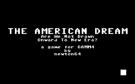
Without further ado, let me be the first to announce (and who else would do it?) my GAMM4 entry: THE AMERICAN DREAM: Are We Not Drawn Onward to New Era?. Pretty pictures!


If you need a few seconds to recover from their awesome majesty, feel free to do so.
To be brutally honest, yes, I’m aware that the game looks horrendous. Laughable, even. Play it, and you’ll see it also lacks a certain amount of polish. But I’m not sure that I mind. Let’s find out why.
The Background
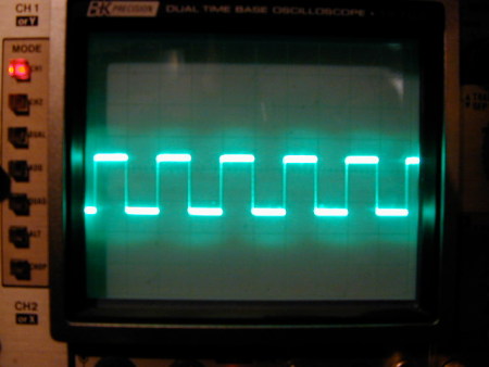
When GAMM4 was first announced, I had no idea what kind of game to put together, so instead I started by thinking about the different inputs one could get out of a button. As Homer Simpson once put it: “This is the light switch. It functions in both the ‘On’ and ‘Off’ mode.” What a wise lesson indeed—that light switch is a lot like life; or, more to the point, like our one button. Obviously, all you can physically get out of it is BUTTON_PRESSED and BUTTON_RELEASED signals, and the magic comes from how you put these together. So I jotted down what I called various modes of button presses: single tap, hold, release, quick taps (think Mortal Kombat’s “Break the Block” minigame), rhythmic (one-button DDR, e.g.), and so on. I drew various square wave diagrams of these different modes, just to imagine the patterns of up-ness and down-osity.
![Come on, wave, don't be such a [ ] Square wave](http://nicknicknicknick.net/images/SquareWave.jpg)

I love both of these square wave images. Don’t make me choose.
And that’s when inspiration struck. You could interpret these square wave patterns one way, then flip them and run them backwards and inverted. I started to think about palindromical gameplay, where in one mode, say, you’re pressing a button rhythmically, until there’s a mode-flip, and instead you’re now releasing the button rhythmically, exploring the Mirror universe of the first mode. The bemonocled idea I had was to use these inverses to “explore the dualities of life,” in terms that my English teachers would have loved, but which are physically painful to write. My GAMM4 submission would be a minigame collection, with candidate pairings such as love/loss, tragedy/triumph, work/play, solitude/friendship, and so on. I came up with a few very rough ideas for minigames, and started moving ahead with the coding.
The Design
I knew from the start that I wouldn’t have the time to do something overly ambitious. I do work a full-time job, and smack-dab in the middle of the GAMM4 production period were the Christmas holidays—one would think this would be a boon, but in fact it meant spending so much time with my family (time I enjoyed, obviously, but during which I could not work on my game). Because of this, and because of my artistic talent (exactly nil), I decided to go the Rohrerian route of low-fi graphics and simple mechanics to examine a single theme (or collection thereof). I took an art design cue from my Atari Flashback 2 and Pong: black and white, and rectangles only.
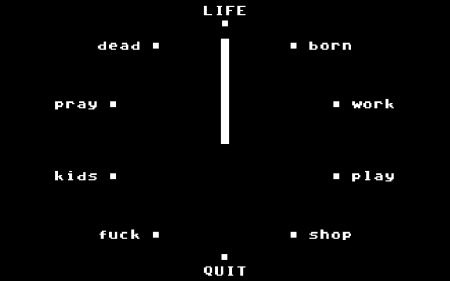
Somewhere along the line, I had the idea for a ticking clock main menu (see image above). Life is a lot like a ticking clock, you see, because it’s round and has twelve notches in it. The “meat” of the game, the LIFE mode, would be a random succession of the various minigames, running for all of five minutes (the GAMM4-specified time limit). LIFE would be placed at the top of the clock, “Quit” at the bottom, and in between would be 10 minigames, each one set across from its “emotional opposite.”
Unfortunately, coming up with five known life dichotomies, or ten themes in total—ones which could be translated into short, quickly-understood one-button games—proved the greatest challenge. The game’s framework (loading and randomly switching between minigames) was coming along, but eventually I hit a hard wall: I had no actual minigames to design and implement. I tried paring the list down, writing the list over from scratch, browsing Wikipedia’s list of human emotions, but nothing was coming. I knew I liked Work/Play (WORK was the first minigame implemented, as it’s the simplest), so I tried building on that. I eventually realised that Birth/Death should also play a part, since the game was about life after all. And somehow—I think perhaps in reading just those four concepts in sequence to myself (Birth, Work, Play, Death)—it started to reveal itself as the American Dream; or at least, a cynical view of it. With that guiding principle finally fixed, and after freeing myself from the arbitrary constraint of strict life “pairs,” a number of other themes/minigames presented themselves, and I was on my way.
The Game
A download link is forthcoming. If it wasn’t already obvious, the game is extraordinarily simple and unrefined. Select one of the themes to the left or right of the main clock, and you play a tutorial version of that minigame. Select LIFE, and play through the five-minute parade of North American mediocrity, gaining points along the way. It’s fun for the nuclear family.
I think I did manage to capture the spirit of these activities well enough, at least for a beginner at this sort of thing.
- BORN is a struggle and, of course, a requirement for all the rest.
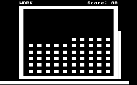
- WORK is arbitrary, repetitive, imposed, and boring. But it makes you the most points.
- PLAY is more improvised than work, and is simple to understand, but I hope moderately challenging. I tried to find some way of achieving flow; it was originally going to be a puzzle game, but this one just occurred to me as more natural.
- SHOP is an endless stream of random products of trivial distinction. And it can make you fat.
- FUCK is about synchronization and attentiveness. Max out your points by maintaining equal levels of arousal.
- KIDS requires you to lead a somewhat unpredictable sprite through various obstacles. Allowing the parent-sprite to absorb the hits loses less points than the child-sprite.
- PRAY is a meditative break from the other minigames. With the promise of huge points in the after- LIFE.
- DEAD is inevitable. Hold on all you like, but it will make no difference. Also, I needed to enforce the five-minute limit.
The Good
And so we move on to the traditional “Say X good and bad things” segment of any good postmortem.
- Some constraints are good. Initially, each minigame was to have its own unique visual “style”, and take up the whole screen/window. I quickly realised, however, that time was fleeting, and that I shouldn’t waste time on superficial visual flair. I settled on a “miniframe” inside the main window (see WORK screenshot above) which would surround each minigame, and allow me to post HUD elements around the outside. This unified “look and feel” gave me a system within which to work, and simplified some of the visual decisions down the line.
- I kind of like the games. WORK and PLAY are, I believe, particularly effective at getting their theme across. The games are perhaps obvious or lacking in design subtlety, but I think they’re playable at least.
- It’s a finished product. Nothing is more important in game design, they say, than finishing your project. And so, here it is. Just another notch on my bedpost.
- It’s not a Canabalt clone. It’s fairly evident that the GAMM4 theme was heavily inspired by Adam Saltsman’s massive one-button hit. More than anything, I wanted to avoid doing something similar, even though, for a long time, my concept for the PLAY minigame was going to be platformer-based, as no other ideas seemed to be forthcoming. I’m glad the final game moved away from that entirely—not a single platform is to be found.
The Bad
- Productivity. I’m a horrible procrastinator. Honestly, a dedicated/experienced programmer would have designed and implemented this game in a week or less. Only as the GAMM4 deadline loomed close did I establish a rigid schedule for myself. I must do so much earlier next time. But at least part of the delay was the result of…
- Designing on the fly. As noted above, my original theme list was much more abstract and difficult to actually turn into minigames. I managed to spend some time coding the underlying framework, but without even so much as a concept for some of the minigames, my work lacked direction. Things become much easier once I’d pinned down what each minigame would be.
- Some constraints are bad. As a corollary to the last point, trying to force myself to come up with a given number of perfectly opposing, abstract themes was crippling. The idea of dichotomies was interesting and helpful to begin with, but it put too much pressure on me to come up with legitimate, easily-implemented pairs. Moving away from that constraint was the biggest boon to the project; I only wish I’d realised it earlier.
- Bonus fail: No shiny polish. I wanted to add such things as leaderboards, proper “game over” screens, interesting game transitions, and more. By the end of the project, though, I was pressed for time (see “Productivity”…) and just focused instead on the main minigames. Unfortunately, that did take a toll on the overall polish of the game… if you can even say that it has any. But, look to the future! More planning, more time in the design phase, and more consideration of those small details will certainly benefit my next project.
The Ugly
Well jeez, just look at it.
And now the conclusion
This postmortem may be a bit verbose for such a simple game. I certainly don’t expect THE AMERICAN DREAM to be selected as one of the GAMM4 finalists played at the upcoming Game Developers’ Conference; this year received a record number of submissions, the majority of them from people with much more experience and talent than I.
On the other hand, this game is a completed project. The goal was to make a low-fi, slightly satirical collection of minigames, and by the power of Greyskull, I think I’ve succeeded in that much at least.